UX pattern
Dark Patterns: The Devil in Digital Design?

What a dark pattern is
Dark patterns are designs that try to confuse people by making certain actions as difficult as possible, or by hiding information they would want.
The option can still be reached, cancelling a subscription for example, but only after steps that wear people down.
Dark patterns also try to persuade people to do things they did not come to do, such as tapping a sponsored ad placed in the most prominent spot on a phone screen.
Examples on mobile
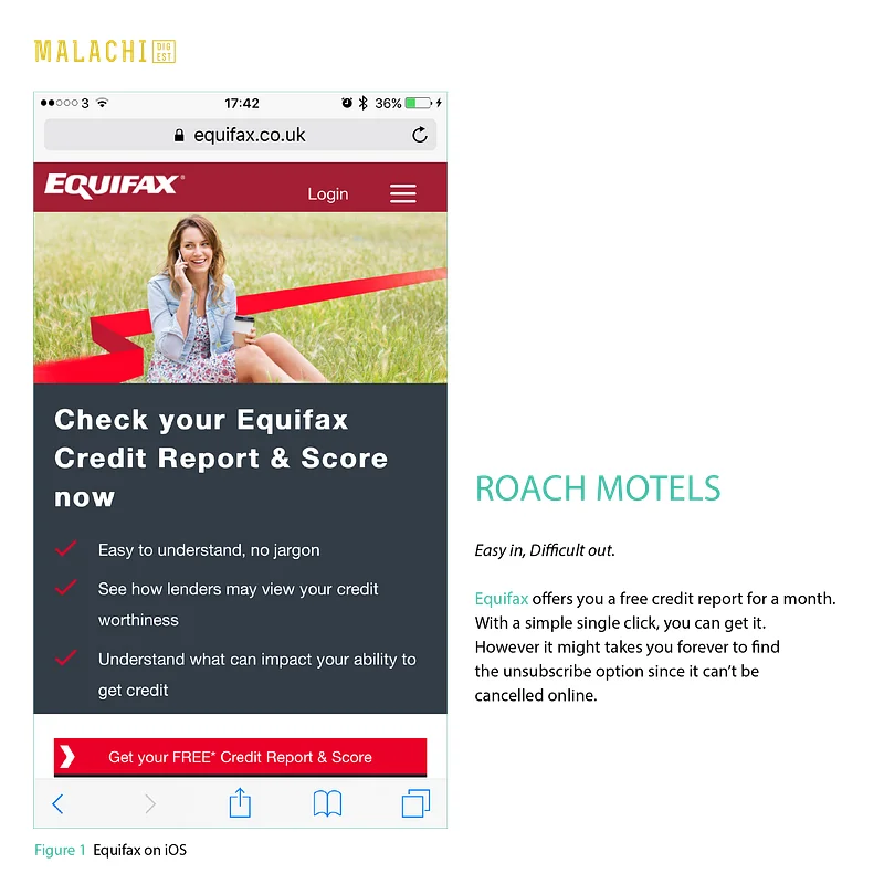
Roach motel: easy in, difficult out. Equifax offers a free credit report for a month. With a single click you can have it. But it can take forever to find how to unsubscribe, because it cannot be cancelled online.
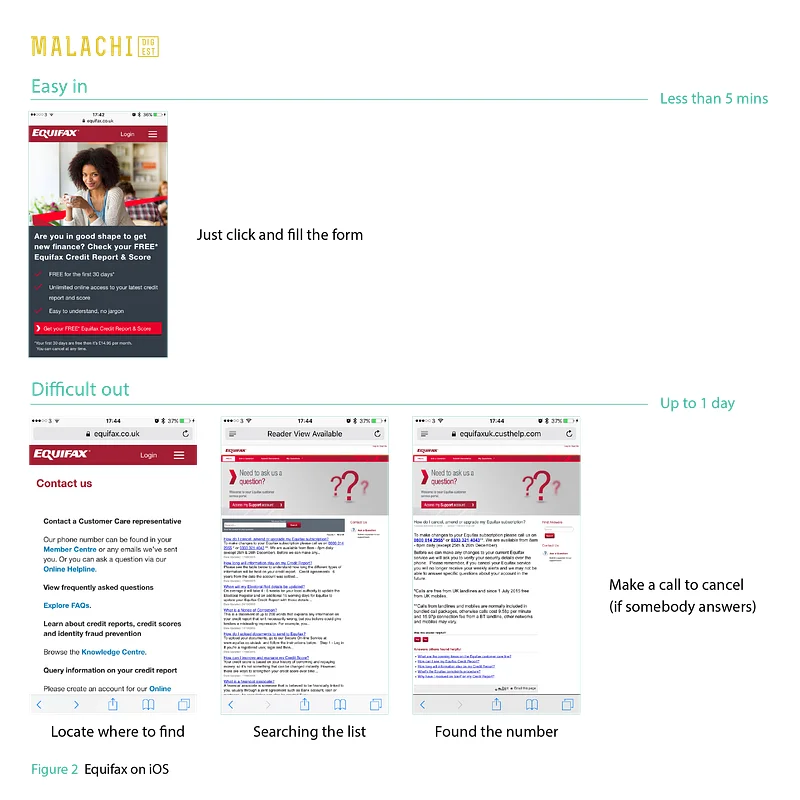
Signing up takes less than five minutes. Getting out can take up to a day: find where to look, search the list of contacts, find the number, then call and hope somebody answers.
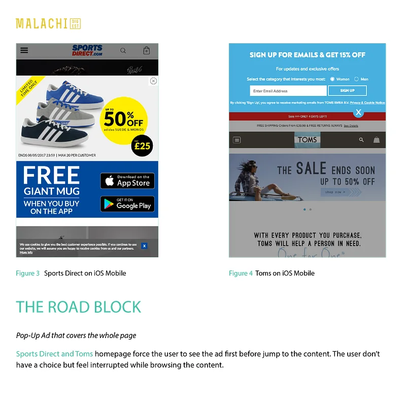
The road block: a pop-up ad that covers the whole page. The Sports Direct and Toms home pages make people see an ad before they can reach the content. There is no real choice, and browsing feels interrupted.
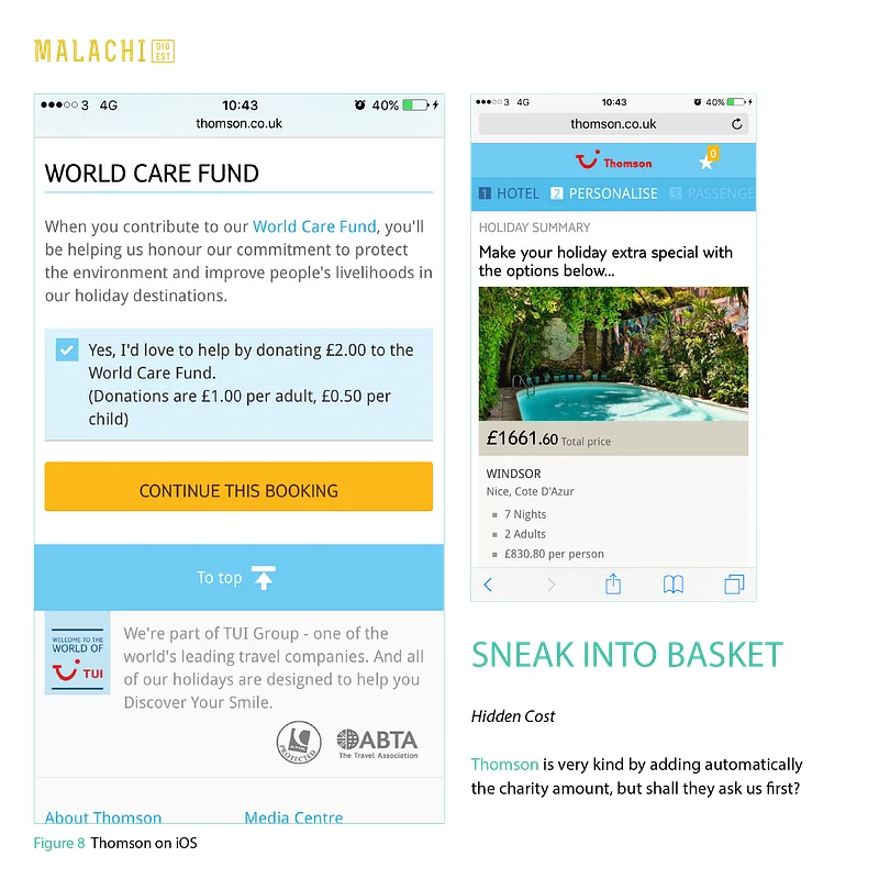
Sneak into basket: the hidden cost. Thomson very kindly adds a charity donation to the booking automatically, but should it not ask first?
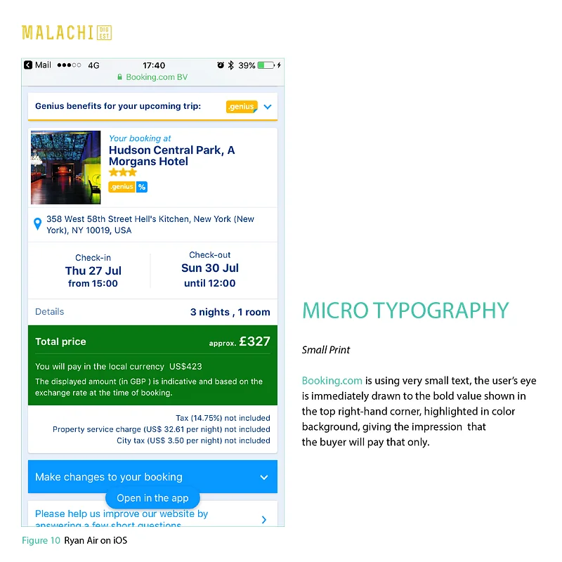
Micro typography: the small print. Booking.com sets important details in very small text. The eye goes straight to the bold price in the coloured box, giving the impression that this is all you will pay, while taxes and charges sit underneath in tiny type.
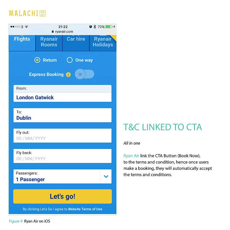
Terms linked to the button: all in one. Ryanair ties the terms and conditions to the booking button, so by tapping "Let's go!" people automatically accept them.
Why to avoid them
There is a fine line between influencing behaviour and tricking people. If designers use persuasion at all, it should be for good, and a win for both sides: the people using the product and the business. Constantly tricking people with confusing or deceptive interfaces quickly loses their trust in a website and the business behind it.
Closing the gap between what people need and what the product wants from them is always the challenge. As the original article put it, dark patterns are not just a UX term: they are a metaphor for the web, culture and politics of 2016.
Why it matters
User control and freedom
People need a clear way out. When cancelling takes four screens and signing up takes one, the design has decided for them.
Consistency and standards
An ad placed where content usually sits, styled like content, borrows trust it has not earned. People tap it because the page taught them to.
Error prevention
Pre-ticked boxes and add-ons slipped into the basket count on people not noticing. The error is designed in, not prevented.
The recommendation
Make the way out as easy as the way in
There is a fine line between guiding behaviour and tricking people. A good test: would the design still work if people fully understood it?
- Put cancel, unsubscribe and delete where people expect them, one or two steps away.
- Mark ads and sponsored items clearly, in a style that is not the content's.
- Leave optional extras unticked, and say what each one costs.
- Write buttons that say what happens, not ones that shame the choice ("No thanks, I like paying more").
Written for the old Brickmann Design blog in 2017, after an article and screenshots by Stefano Malachi on Muzli, and lightly edited for the Lab.