
Lab · Pattern
Annotation
A way to point at a problem without leaving the work. The ink sits over the screen, the note sits beside it, and they draw in the order you would say it out loud: what is wrong, where, then the circle.
01Design review
Before and after, marked in two inks
When a redesign needs to show its reasoning. Red for what broke, green for what replaced it, so a reviewer can read the change without the meeting.
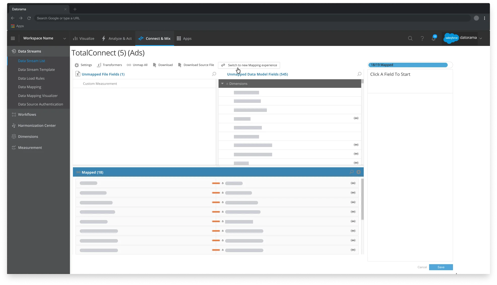
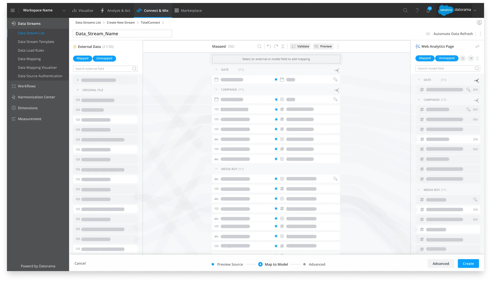
The Datorama mapping screen from Designing for legacy UIs. The old flow asked people to finish a task it never showed them; the new one puts the task, the check and the next step on one page.
Before
After
02UX teardown
Naming a dark pattern where it lives
When a pattern is easy to describe and hard to see. Circle the parts that do the persuading, so the argument is the screenshot.
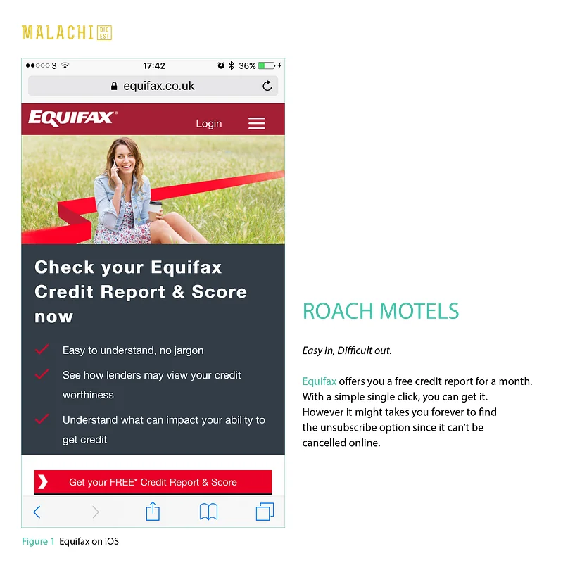
Equifax, from Dark patterns: a roach motel. Everything on the page is about getting in; nothing is about getting out.
Equifax on iOS
03Self review
Marking my own shipped work
Before a hand-off or a release, on your own screens. It is faster to fix what you have circled than what you vaguely remember.
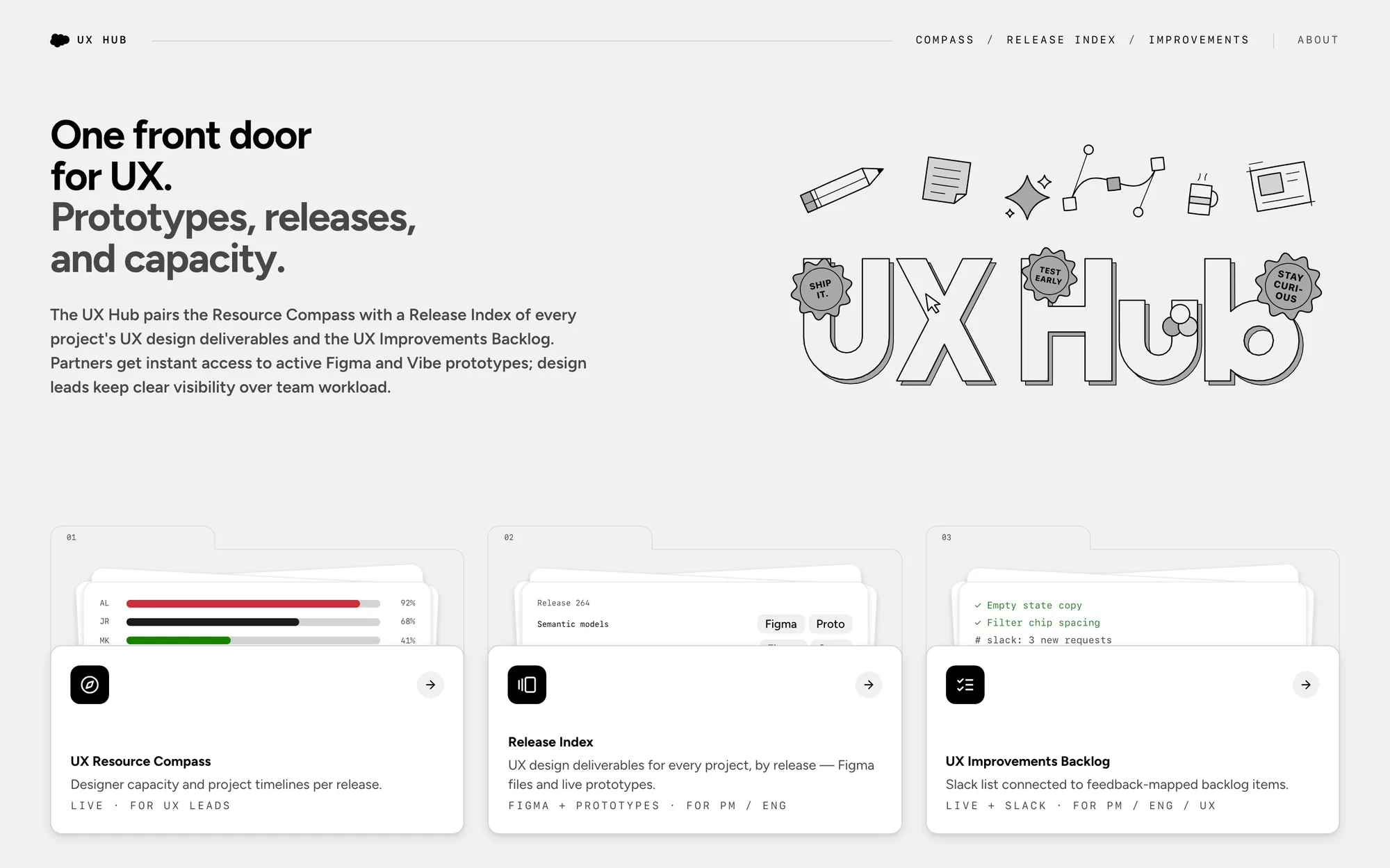
The UX Hub home, after it went live. Small things, all fixable in an afternoon, and all invisible until they were circled.
UX Hub, home
04Prototype review
Following something that moves
On a live prototype or a looping demo, where the problem only exists for two seconds. The mark tracks the element and lifts while it is gone.
A backlog panel in the style of the UX Hub, running live in the page. The toast arrives every few seconds; watch the ink arrive and leave with it.
Live prototype
05Copy review
Editing words where they sit
For case studies, release notes and UI copy. A bracket for the paragraph, underlines for the phrases, in a quieter ink so it reads as an edit, not a verdict.
The opening of Designing for legacy UIs, given one more pass.
Draft
That happened to our team when we had to rebuild one of the core functions of Marketing Cloud Intelligence (formerly Datorama). It was frustrating. But once we took the time to fully understand what we needed to achieve, we found we could work with the constraints by focusing on a few clear goals.
How to mark
Point, don't describe
One loop per problem, around the smallest thing that shows it.
Short notes
Under eight words, lowercase, said the way you'd say it across a desk.
Ink means something
Red is wrong, green is the fix, grey is an aside. Never decoration.
Draw in reading order
Note, line, loop, one mark at a time, so the eye is led and not flooded.