Tool
GeoBrick: A Typeface Built From Triangles and Circles
A
One solid triangle.
- Straight edges
- 3
- Curves
- 0
- Pieces
- 1
- Holes
- 0
- Ink
- 46%
Ink is how much of the character's box is black.
The idea
How far can an alphabet be pushed toward pure geometry and still read as letters? GeoBrick tests that with solid triangles, discs and half discs, held together by thin straight strokes. Every letter started as a sketch in a dotted notebook, then was redrawn on a grid and exported as an OpenType font. Pick any character above to see it large and what it is made of, or type a word to set it in GeoBrick.
What the letters are made of
Taking the font file apart shows how few ideas carry all 36 characters. Each one pairs two kinds of mark: heavy solid shapes, and hairlines.
- Half straight, half round. 18 of the 36 characters use straight edges only, from A, V and W to E, H and Z. Only O and 0 have no straight edge at all.
- Split down the middle. O and 0 are half a solid disc and half a hairline ring. G makes the same split from top to bottom.
- Almost no holes. Only O, Q and 0 have a hole. Every other shape stays open, which keeps the black areas big and bold.
- Loose parts. In E and F the top bar floats free of the rest, and the tail of Q is a separate piece.
- Weight on purpose. B is the heaviest character, with 81% of its box in black, and 3 is the lightest at 20%. The average is 45%, so the solid letters read loud and the hairline numbers read quiet.
The font
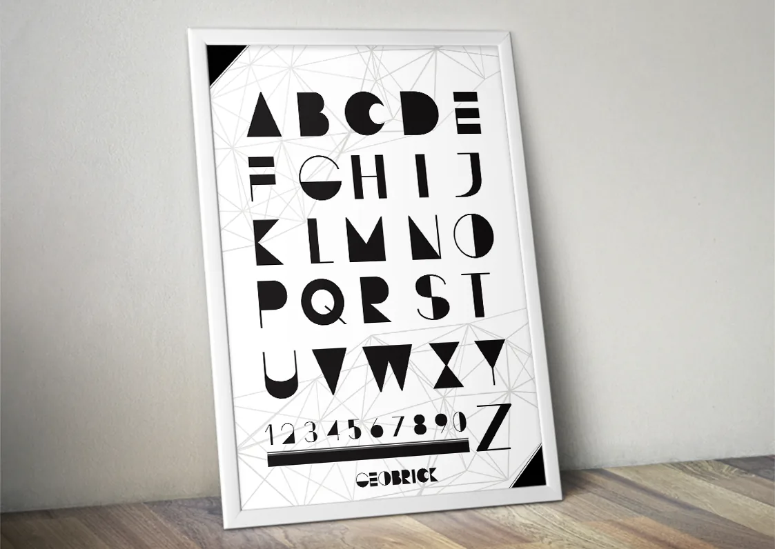
| Font | GeoBrick |
|---|---|
| Type | Display typeface |
| Characters | A–Z and 0–9, capitals only |
| Format | OpenType (.otf) |
| Released | November 2013 |
| File | BrickmannDesign.otf, in a zip under 4 KB |
It works best large, in titles and on posters: the hairlines fade at small sizes, and there are no lowercase letters.